BizViz's Big Data Analytics for Automobile Industry
Starting with the overview of the steps followed by BizViz in the automotive industry, we undertook the following procedure:
- Data has been collected from various websites like Team-bhp.com etc.
- Data collected for analysis included different types of reviews, comments made by many number of customers, sales data of maximum number of cars available and Specification & features data for the respective cars.
- With the use of Data analytics on top of that, we achieved making some reports like showing the trend of percentage of total number of reviews vs. sum of total sales categorized as per manufacturer, Correlation between sales data of the vehicles and vehicles categories as per Availability, Comfort etc.
Following were the various technical phases in this complete analytic process:
- Data Collection
- Cleanup
- Data Processing
- Data Organization
- Analytics
- Dashboards / Reporting
- With the use of Data analytics on top of that, we achieved making some reports like showing the trend of percentage of total number of reviews vs. sum of total sales categorized as per manufacturer, Correlation between sales data of the vehicles and vehicles categories as per Availability, Comfort etc.
Data Collection:
This phase included collection of data from the various websites like Team-bhp.com etc. for our various analytic purposes. This stared with scraping of data using WEB Scrapping, from different websites and scrapping was accomplished using images available from the same websites as mentioned above. As a result we collected more than 75,000 comments/reviews of more than the 89 models available in Indian market. For the same 89 models, sales data from April-2012 to Mar-2013 and Specifications & features data was also collected using the same process. The motive behind collecting such amount of data was to get more and more insight into analytics and correlations between the data which would be commenced in further phases. However the data collected had a very diverse and unstructured format which could be no use in the analytics in the current form. The data was stored in Hadoop Clusters (in HDFS).
Data Cleanup:
As mentioned in previous phase the data collected was in unstructured format. This Unstructured data collected from different websites was mostly the raw data with all the relevant information hidden deep down in the data. But before the data can be processed to retrieve all the hidden information from it, it needed to be cleaned out. Basically data cleanup is preparing data for processing. Some of the Natural Language Processing techniques which were used to clean the data are as follows:-
- Conversion of all the text data to lower cases for exact matches
- Removal of punctuation marks
- Removal of some of the numbers as they might be irrelevant to us
- Removal of generic and custom stop words
- Stemming words for exact matches
Data Processing:
As we know, all this huge amount of data collected in these initial phases was in unstructured format and could be put to no use for the analytical process. This data needed to be structured and categorized into relevant information which could be put to use to figure out some meaningful details, so that it relay some useful reports. Following were the steps used to make this unstructured data into structured form:
- Initially, complete data was dumped into R-tool
- Then through machine learning algorithm in R-tool, we used Cluster Analysis to cluster the complete data.
- This was then used to categorize into specific categories obtained from Cluster Analysis.
-
The Categories Obtained from the Cluster Analysis were Availability, Comfort, Engine, Looks, Mileage, Price, Quality and Service.
- After this using the machine learning algorithm named Naïve-Bayes Algorithm, we distributed the 75,000+ comments/reviews obtained previously into the above mentioned categories.
-
Again using the same machine learning machine learning algorithm, we figured the sentiments of these comments, as Positive, Neutral and Negative.
Now after completing this process, we started structuring sales data and Specification & Features data of the 89 models.
Data Organization:
The whole processed data above was updated to HDFS; a table structure was created in Hive. This data now became structured data which could easily retrieve using Hive Query Language. Here we have mainly three tables in our HDFS and table structures of their respective tables are presented below: Reviews Table: - Containing all the comments from team-bhp.com categorized into different categories (like service, engine, mileage etc?) and also classified these comments into positive and negative comments. ? Make, Model, Comments, Category, Sentiment Specification Table: - Containing all the specifications for a particular model and make ? Make, Model, Segment, Engine Features (like Volume, Power, Torque, Speed, etc.), Specifications (like Having ABS, Power Steering or not etc.) Sales Table: - Containing all the sales data for a particular model and make in around April - 2012 to March - 2013. ? Make Model, Segment, Sales data, Period.
Data Organization:
- Now after the whole phases of Data Collecting, Cleaning, Processing, Organizing, the data was now available for applying any type of analytics on top of it.
- Again here the R-tool was put to use find correlation between the sales of the 89 models and the categorized reviews taken as percentage of total reviews in the specific category.
- Here the text file of the complete structured data is given as input to the R-tool then with the help of Multiple Correlation Analysis; we were able to find out some Correlation between the sales of the vehicles from different types of Segments and with the categories of the vehicles obtained earlier.
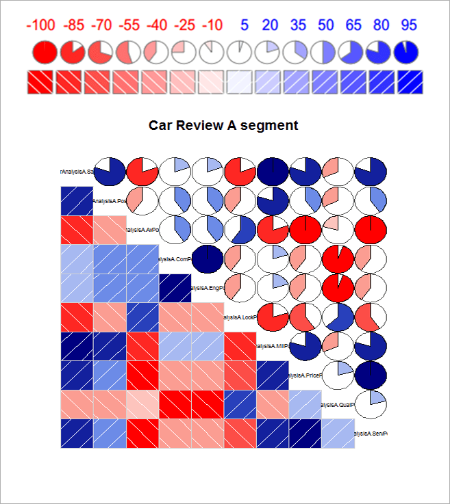
- Here in the below picture, A Correlogram showing the Correlation between Sales of the vehicles of a particular Segment (Segment-A) with the Percentage of the total number of reviews categorized according to the Categories obtained for a particular Segment (Segment-A).
- Here the text file of the complete structured data is given as input to the R-tool then with the help of Multiple Correlation Analysis; we were able to find out some Correlation between the sales of the vehicles from different types of Segments and with the categories of the vehicles obtained earlier.
- The dark blue colour indicates Strong Correlation and dark red indicates No Correlation. The Strength of Correlation increases from left to right as dark red colour gradually fades out and turns out to dark blue i.e., from No Correlation to Strong Correlation. The Numbers above the circles showing correlation percentage of the respective categories.
Dashboards / Reporting
As the current market demands the data also needs to be graphically represented to make fast and precise decisions. This can be achieved through various dashboarding/reporting tools available in the market. We have used Tableau Desktop 8.0 and other tools available in the market for this purpose.
All these dashboarding tools have various database connectors available for connecting to the variety of data. As our data was stored in HDFS, we used Hadoop/Hive Connector available in the respective tool to fetch the data from the database. Here we have used MapR Hive Connector in Tableau to connect the structured data in Hive. Through this data, by applying some algorithms and queries we have done the following reports.
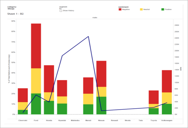
For Pane: Percentage (%) of Total number of reviews: Colour shows details about sentiment (Negative, Neutral, and Positive). The data is filtered as per category (Availability, Comfort, Engine, Looks, Mileage, Price, Quality, Service), showing only for Mileage category. The view is filtered on segment (A, B1, B2, C1, C2, D1, D2, and Utility) wise also showing only for B2 segment.
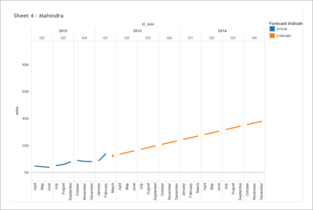
For Pane: Sum of total sales(actual & forecasted) Quarter wise. The data is filtered as per Manufacturer (Mahindra only).
Color shows details about Actual Sales and Forecasted Sales.
For Pane: Sum of total sales(actual & forecasted) Quarter wise. The data is filtered as per Manufacturer (Mahindra only).
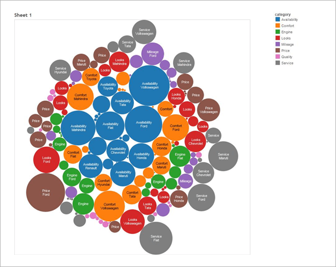
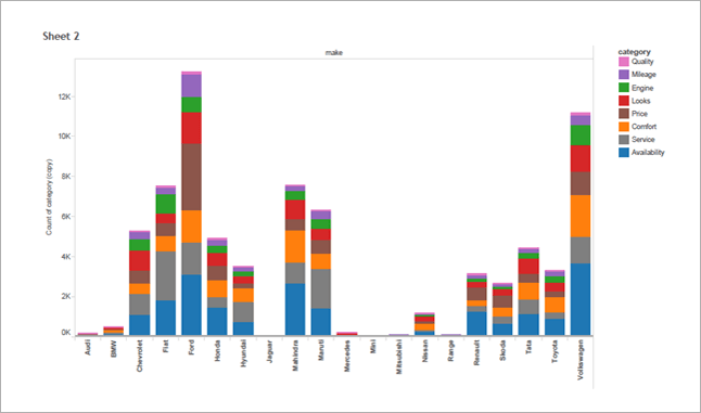
Color shows details about Actual Sales and ForecasShowing Total Number of Reviews according to Category and manufacturer. Color shows details about category. Size shows Number of Reviews according to Category. The marks are labeled by category and Manufacturer.
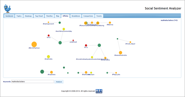
Sentimental Analysis: -
What is a Sentiment? It may be an attitude towards something, a feeling, or an emotion. We all have sentiments on a daily basis and we express them through various media, such as talking, SMS-ing, chatting, painting, dancing, etc... In the past few years, we have expressed our sentiments through popular social media such as Facebook, Google+, Twitter, blogging, etc. and by using hash-tags.
People broadcast their emotions on social networking sites to let their friends and the whole world know what they feel about certain things. We are using Twitter as the medium to describe my sentimental analytics. As studies have shown, on an average, 140,000 tweets are broadcast every second. You can imagine the enormous number of tweets that are produced each day, and more so during the span of a year. As you can see, a staggering amount of data is generated everyday which is can be analyzed for useful information. Along with information that would be useful for marketing and sales, this enormous wealth of data contains peoples' views, emotions, opinions.
Below snapshot's displays the sentiments of "Mahindra Bolero" key search.