Best Practices for Building Dashboards
Introduction
A dashboard should be considered the company’s single source of truth. Any executive can look at it and immediately get a sense of how the company is doing and where it stands in relation to its own goals, its competitors, and the overall market so they can make smarter data-driven decisions.
Gartner defines the dashboard as :-
“Intuitive interactive displays of information,
including dials, gauges, sliders, checkboxes and traffic lights. These displays indicate
the status of an item or the state of a performance metric compared with a goal or
target value.”
The dashboards are business tools that visualize the most important information needed to achieve a business’s objectives, displayed in real-time from multiple data sources.
Good dashboards enable users to monitor and measure performance and metrics in real-time on the go. You can visualize & analyze data and focus on Key Performance Indicators (KPIs) from across the organization on a dashboard, helping you gain valuable insight and drive quick and accurate decision making.
Where to start?
There are numerous ways to implement a dashboard solution, however, not all of them are efficient or effective. Before starting a dashboard initiative, organizations should plan out their project and address it from every context possible. Strategically planning a dashboard project helps organizations focus on their goals and ensure their dashboards are effective.
The 3 most important question to ask before developing a dashboard
- Who will be the audience of the dashboard?
- What value will this dashboard add to the existing process?
- What type of dashboard I have to develop to communicate information to the stakeholders?
According to Gartner :-
"The main purpose of a dashboard is to enable managers to
quickly and routinely comprehend how they are performing against their KPIs, not to
provide an environment for complex data analysis."
Who will be my audience?
Dashboards are to be developed, starting with the audience in mind. People in general look at the world from the perspective of their job role, their relationships, their location, and their experience. As you start designing the dashboard, understanding the motivations and needs of your dashboard consumers will help you develop a dashboard that they don’t just view, but engage with.
What value will the dashboard bring?
Dashboards can serve many purposes. Take an effort to consider what you want to get out of the dashboard before you started to create one. Value or Impact of your dashboard vary according to the business or industry operation, we have given few cases below to help you understand:
Displaying operation and provide alerts whenever problems occur, Communicating progress and success to the respective stakeholders or Providing a common interface to users for interacting and analyzing important business data from multiple sources.
What type of dashboard to develop for communicating information to the stakeholders?
Good dashboards focus on the most important information and communicate the information clearly and concisely. The most common mistake we see often in dashboard design is treating all information as if it is equally important.
The dashboard should be more than a lot of data on a screen. It should have a core theme based on the essence of the problem.
A particular dashboard may be valuable to one member of your organization and not valuable to another. For example, a CFO may need a very detailed dashboard that gives him/her the ability to drill down into data to get insights, while a CEO may want a dashboard that offers him/her an easy to understand overview of the company ’s overall KPIs.
Choosing the right metrics that matter:
One key challenge in developing a dashboard is determining which metrics and KPIs to include. For your users to find value out of the dashboard, you should include metrics that matter to them.
Good metrics offer two things:
- They help you identify how your organization is doing
- They tell you what to focus on. That’s why it’s important to have them prominently displayed. They keep you on track! Tracking the wrong metrics is almost as bad as tracking nothing at all.
Dashboard Design Best Practices (BI)
In general, there are eight different information types:
- Time Series
- Ranking
- Part-to-Whole in Percent
- Nominal Comparison
- Correlation
- Frequency Distribution
- Deviation
- Maps
Start by identifying which information type the data you have to represent. Each information type has only two or three chart types that are appropriate for optimal information display. Review the possible chart types and select the most appropriate one.
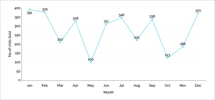
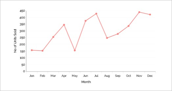
1.) Time Series:
Multiple instances of one or more measures taken at equidistant points in time.
These values display how a measure changes through time.
Recommended Chart types for Time Series:
Line Charts to emphasize the overall pattern
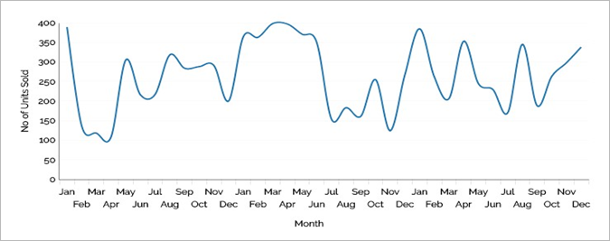
Bar chart to emphasize indivudual values
Line charts with points to slightly emphasize individual values while still highlighting the overall pattern
Design suggestions for time series charts:
- Always place time on the horizontal axis.
- Start the Y-axis at zero.
- Lines to emphasize the overall pattern.
- Bars to emphasize individual values.
- Points connected by lines to slightly emphasize individual values while still highlighting the overall pattern.
- A combined line-vertical bar chart is useful when two measures need to be displayed. In which the line is associated with the left Y-axis and the vertical bars are associated with the right Y-axis or vice versa.
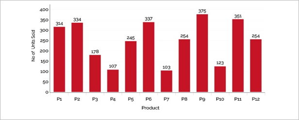
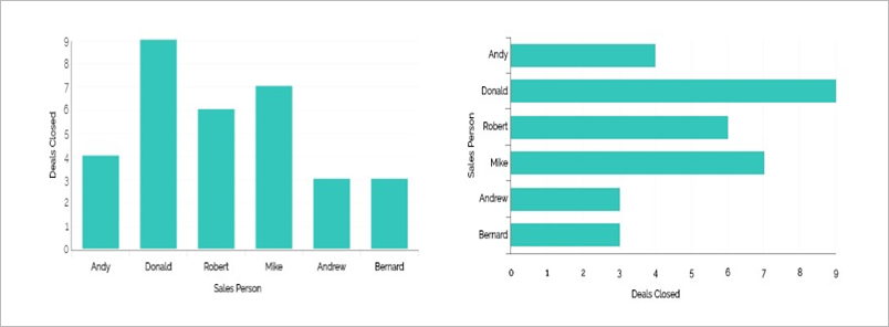
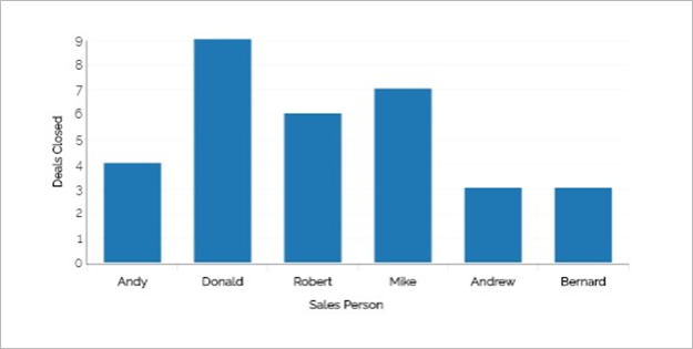
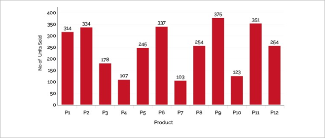
2. Ranking:
Categorical subdivisions of a measure ordered by size.
Values are ordered by size either ascending or descending.
Recommended Chart types for Ranking:
Horizontal Bar Chart
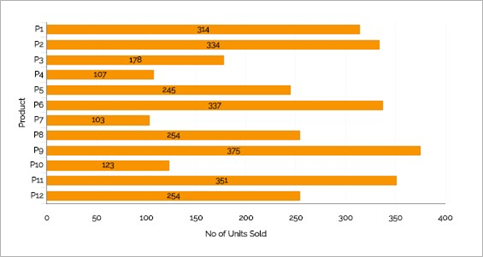
Vertical Bar Chart
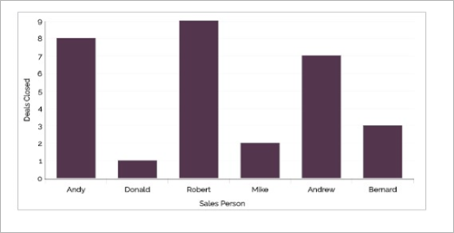
Design suggestions for ranking charts:
- Bars only (horizontal or vertical)
- Sort in descending order to highlight high values.
- Sort in ascending order to highlight low values.
- Start the quantitative axis at zero.
3. Part-to-Whole in Percent:
Measures of individual categorical subdivisions as ratios to the whole.
Values are represented in parts (ratios) of a whole.
Recommended Chart types for Part-to-Whole in Percent:
Vertical Bar chart
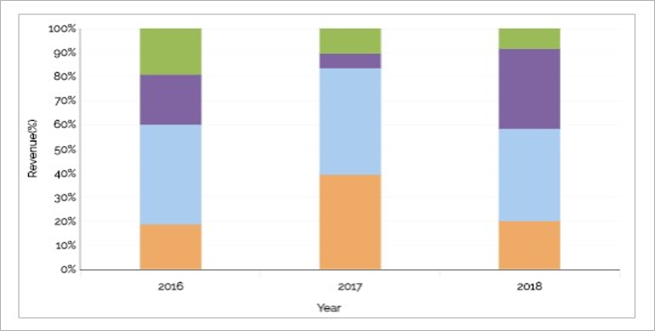
Horizontal Bar chart

Pie chart
(Pie Charts should only be utilized to depict percentage value)
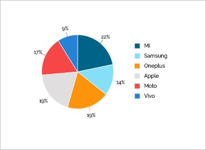
Design suggestions for Part-to-Whole in Percent:
- Use stacked bars only when you must display measures of the whole as well as parts.
- Use only percentage values in the pie chart and not actual amounts in the pie charts.
- Make sure all percentage values are visible in a pie chart.
4. Nominal Comparison:
A simple comparison of the categorical subdivisions of one or more measures in no particular order. (comparison of values for a set of unordered items)
Recommended Chart types for Nominal Comparison:
Bars only (horizontal or vertical)
5. Correlation:
Comparisons of two paired sets of measures to determine if as one set goes up the other set goes either up or down in a corresponding manner, and if so, how strongly.
Recommended Chart types for Correlation:
Scatter plot
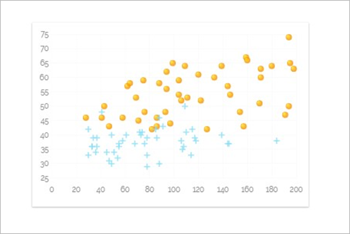
Radar Chart
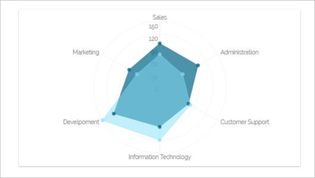
Bars may be used, arranged as a paired bar graph or a correlation bar graph, if scatter plots are unfamiliar.
Design suggestions for Correlation:
- Points and a trend line in the form of a scatter plot.
- Gartner magic quadrant is an example.
- Use radar chart for more than one quantitative value. Each quantitative value can be plotted on the radii or spoke.
6. Frequency Distribution:
Counts of something per categorical quantitative range.
Recommended Chart types for Frequency Distribution:
Vertical bar charts to emphasize individual values.
Line Chart to emphasize the overall pattern.
Gauge (Speedometer, Barometer or Thermometer)
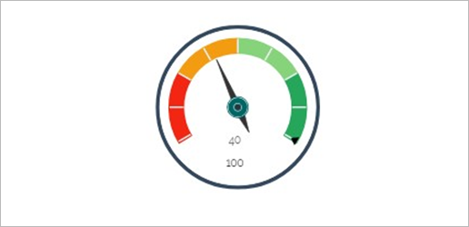
Design suggestions for Frequency Distribution:
- Good for showing the bell curve effect.
- Start the Y-axis at zero.
- Use Gauges for real-time metrics that need to remain within a defined tolerance range
7. Deviation:
Categorical subdivisions of a measure compared to a reference measure expressed as the differences between them.
The difference between two sets of values (Example: The variance between actual expenses and budgeted expenses)
Recommended Chart types for Deviation:
Vertical Bar charts
Design suggestions for Deviation:
- Lines to emphasize the overall pattern only when displaying deviation and timeseries relationships together.
- • Points connected by lines to slightly emphasize individual data points while also highlighting the overall pattern when displaying deviation and time-series relationships together.
- Bars to emphasize individual values, but limit to vertical bars when a time-series relationship is included.
- Always include a reference line to compare the measures of deviation against
8. Maps:
Color-intensity Map
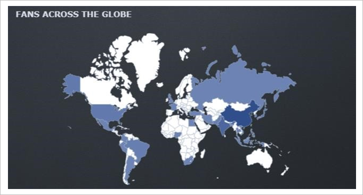
Heat Map
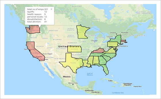
Design suggestions for Maps:
- For color-Intensity maps, use the same color varying the shade based on the quantitative amount. Low values are coded with lighter shades and high values are coded with darker shades.
Functionality
You want to outline few common features that can make your dashboard more useful. Depending on the form that you’ve chosen, the dashboard can be a much more than simply a chart on a page.
- Drill down: Ability to go from a summary metric or view to additional detail that provides more context and break out of the information.
- Filters: Allow users to define the scope of the data in the dashboard to reflect their needs. Filters can either be global (refining scope for the entire dashboard) or local (refining scope for a specific chart or metric).
- Comparison: Ability to see two or more subsets of the data side-by-side. A line chart, for example, may let the user view two geographic regions as separate lines.
- Export/print: Give users the ability to pull information out of a dashboard. Export to formats that let users do more with the data like Excel & CSV and also PDF.
Dashboard Layout and Positioning:
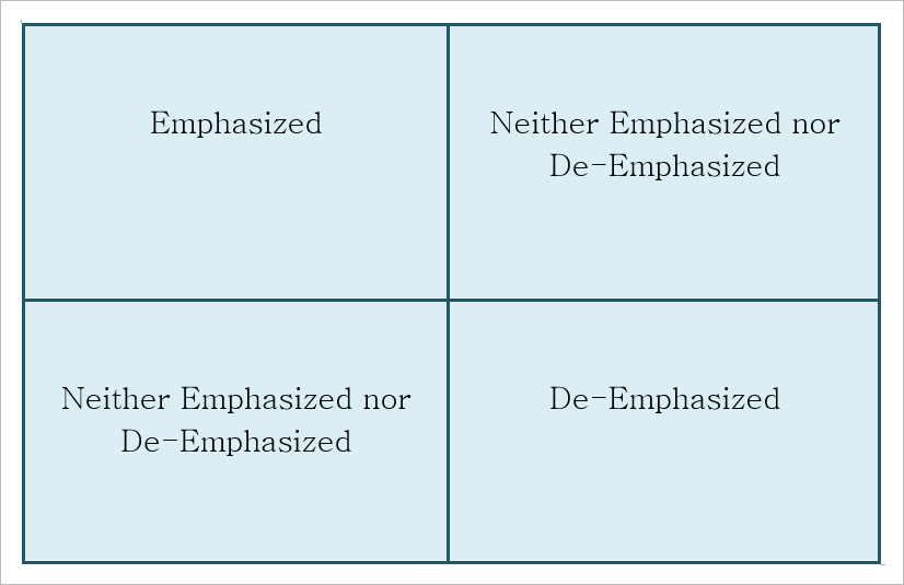
Position content in places based on importance.
Position content in a logical order.
Don’t force all dashboards into a grid layout.
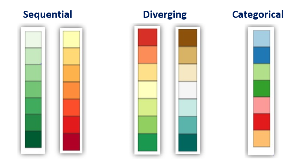
Color
Color can draw your eye to what is important and tie together similar things. For example, if we increase color brightness, it will attract attention and make a point seem more important. Similarly, use of the same color hue can be used to connect things that are related.
When you are using color in your graphs to represent data, there are three types of color schemes to consider:
- Sequential when you are ordering values from low to high.
- Divergent when the values are ordered and there is a critical mid-point (e.g. an average or zero).
- Categorical when data falls into distinct groups (e.g. countries) and therefore requires contrast between adjacent colors
About BDB
BizViz Dashboard Designer is a web browser-based application used to build dashboards and design analytics. It comes preloaded with a wide range of charts, features, and data integration capabilities that empower users to create informative and appealing visual representations of their data.
Big Data BizViz is a Decision Platform that has a Big Data Pipeline framework to handle Streaming, Structured, and Unstructured data. Our micro services architecture based modern platform can be integrated with famous business applications or can give customized Analytics flow. It has the elements of Augmented Analytics, Machine Learning with top end Visualization. BDB Platform is used by all layers in an organization like CXOs, Citizen Data Scientist, Data Scientists, Business Analysts, Business Users, etc..